The splash function of unity is set under player setting
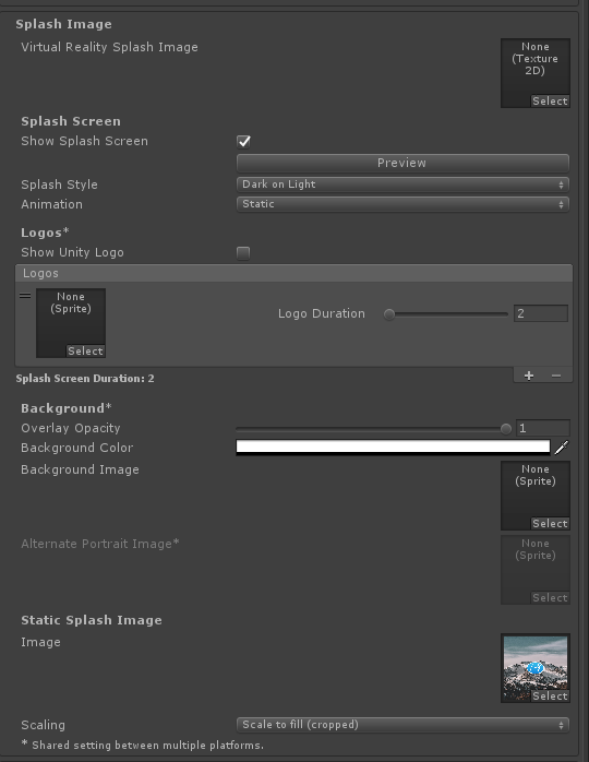
Common configuration options are generally understood. There are two problems in use
1. How to reduce the logo
Logo with background image, logo will be very large, more ugly, because the size of logo image is fixed, and the width occupies more than half of the screen width
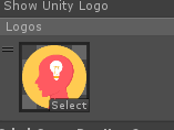
For example, set the logo to this:
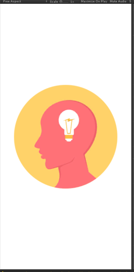
The display effect of spalsh is as follows:
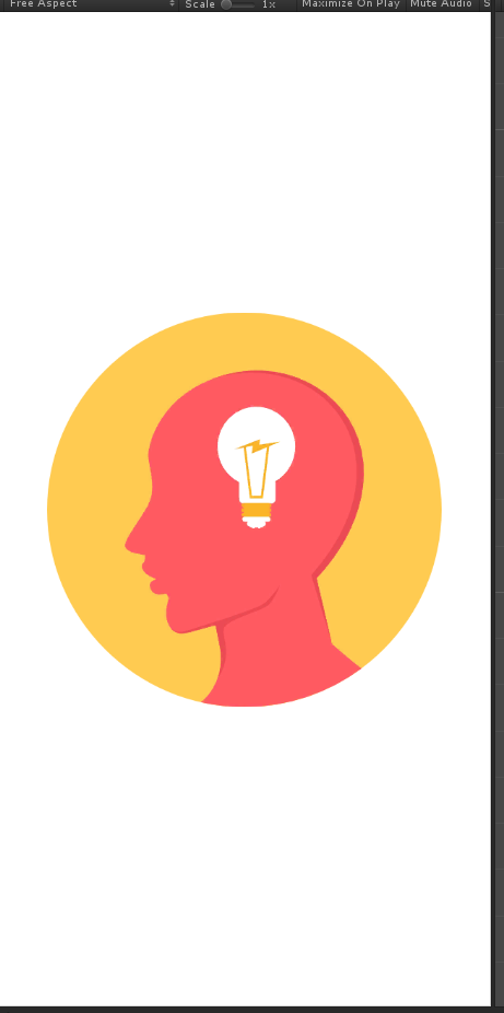
Want to reduce the logo, how to do
The solution is to set a solid color background, reduce the logo, and put it in a large image, such as logo.png. The background of logo.png is set to the same color as splash background color
For example, if the background is white, the background of logo.png is also set to white

In this way, when logo.png occupies the middle of the screen, the real logo only occupies a small part of the middle of the screen, realizing the reduction of the logo
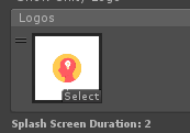
Note that the background outside the logo of logo. PNG cannot be set to transparent
As shown in the figure above, unity will automatically enlarge the logo
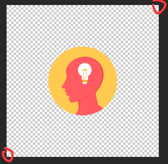
So, the background does not want to be set as a solid color, but as a background image?Using the characteristics found in the above process, there is a clever way. When we make the logo of pure color PNG, we can add two dots in the two opposite corners of the picture according to the similar color of the background picture
For example, I put two white dots on the position of the red circle in the figure:
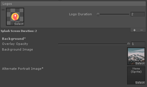
Then use a white background image:
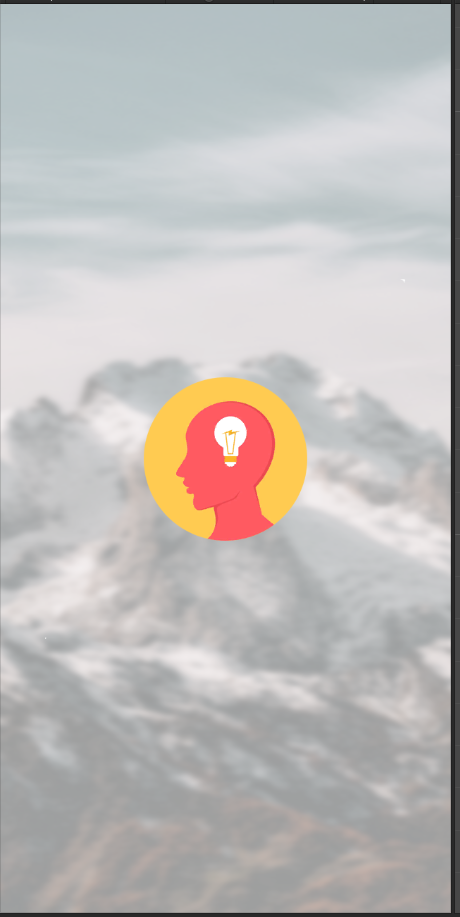
This is the effect:
2. Clear background
But the splash background is always fuzzy after setting in this way. What should I do
You can turn off show splash screen, and then set a large image with logo and background in the static splash image, and select scale to fill (cropped) for scaling
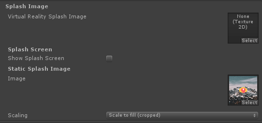
This is the effect, very clear:
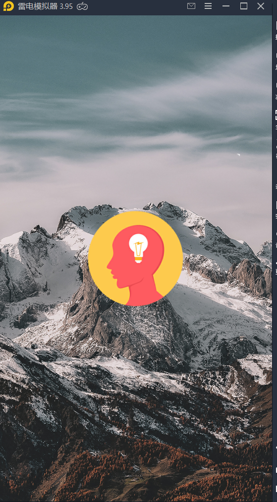
There are three ways to scale
Center (only scale down) will try to draw your image “pixel correct”, with no scaling unless needed to fit it on screen.
Center (only scale down) will try to draw your image “pixel correct”, with no scaling unless needed to fit it on screen<
scale to fit (letter boxed) will try to draw your image full screen, but without cropping it, an fill the empty space with black pixels.
adaptive zoom size (aspect ratio unchanged) attempts to display full screen, but does not crop, and fills the blank with black
scale to fill (cropped) will draw your image full screen, and cut the parts which extend outside the screen.
adaptive fill (cropped) will be displayed in full screen, and the part outside the screen will not be displayed
Generally we choose the third one. If the graph is larger, there is no difference between the first two methods. However, when the graph is smaller, we can see the difference between the three methods
Center (only scale down), just zoom out, not zoom in:
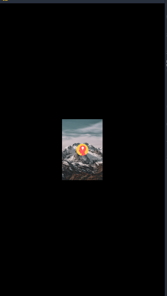
(note that when your picture is very large, but the scale is not consistent with the screen scale, you will keep the length width ratio of the original picture unchanged and simply reduce it until the screen can display all the contents of the picture, so there will also be black edges.)
For example, the original picture is like this:
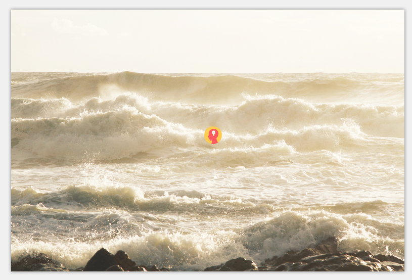
The display effect is as follows:
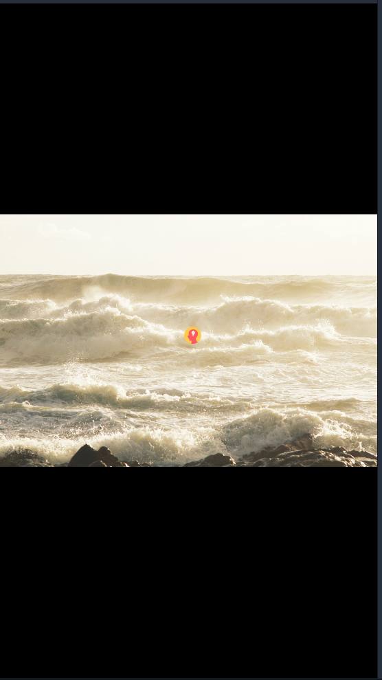
Scale to fit (letter boxed). In this case, as long as the proportion is not appropriate, no matter the image is too small or too large, the image will be reduced or expanded in equal proportion to display the whole content of the image, and keep the length or width of the image full of the screen
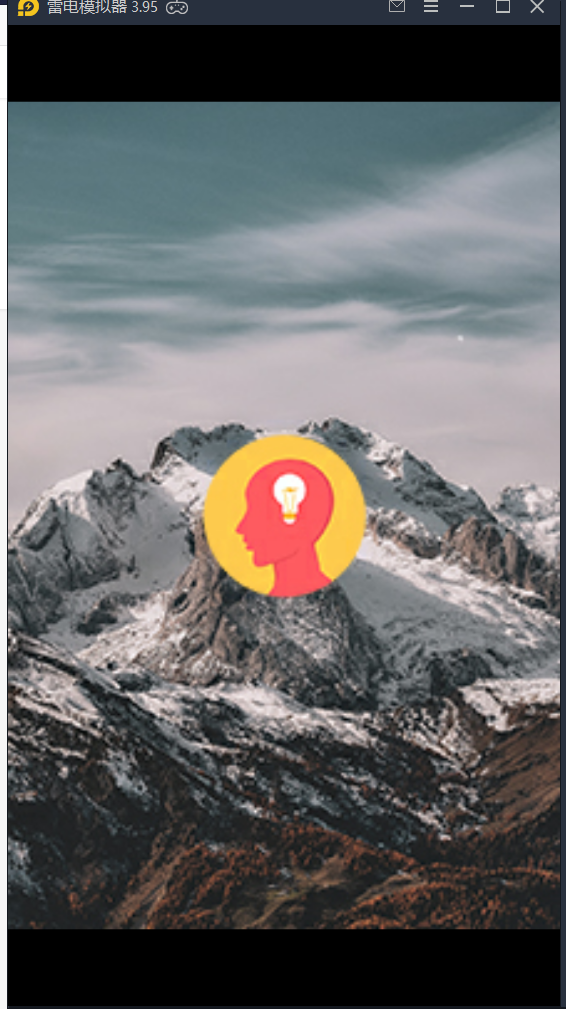
Scale to fill (cropped). When the image is too large, scale it down until one of the length and width of the image is exactly equal to the screen. When the image is too small, it is stretched proportionally until there is no black edge

3. The background should be clear and the logo should be animated. What should we do
This is simpler. First, set up a clear background image without logo in the static splash image. Then write an animation of the logo in your first scene. The background is still the big picture in the static splash image. In this way, when the program starts, the background will be displayed first, and then the logo animation with background will be displayed in the scene
However, we need to master the proportion and size of the image to be cut, so as not to be seen by people switching between scenes
Similar Posts:
- Expected rbrace error encountered in DW
- java.lang.RuntimeException: Canvas: trying to draw too large(203212800bytes) bitmap.
- attributeError: ‘NoneType’ object has no attribute ‘shape’
- [Solved] Transparent background PNG Convert to JPG with Balck Background Issue
- [Solved] error: resource style/AppTheme (aka com.example.myapplication:style/AppTheme
- How to Solve Ajax Error 500 (Internal Server Error)
- X shell 4 [solarized dark]
- What are the recommendations for pdf editor? Try this convenient and easy to use editing software
- Solve the problem that the highlighted content exceeds the visual area when the introjs scroll bar appears
- Summary of internationally renowned CSS Reset